Payments comparison — Web App ©2025

The Payments Market
The Payments Market helps businesses compare card payment providers, whether they want to cut their fees or take cards for the first time. The site wasn't converting, so I redesigned it to bring in more leads, and better ones.
The problem
The homepage explained who The Payments Market were, listed their partners and outlined the concept. It never made it obvious why a business should care.
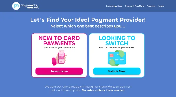
Then it asked visitors to pick between two CTAs, one for switching providers and one for businesses new to card payments, before they'd even understood what they'd get. The form after that had enough friction to lose most people before they reached their results.
Who uses it
Two kinds of business come to the site. Ones already taking cards who think they're paying too much, and ones that don't take cards yet. Both want to see their options quickly.
The client needs something different. Leads that are qualified enough to be worth following up. The redesign had to work for both.
Key decisions
One CTA instead of two
The two CTAs were meant to be helpful. In practice they made people categorise themselves before they knew what the site could do for them. I cut them down to one, Get a quote. Whether you're new or switching is now a question inside the form, where it actually belongs.
Copy that starts with the user's situation
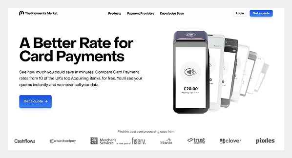
I rewrote the homepage to lead with the visitor's problem, not the product's features. If you're paying too much on card fees, or you don't take cards yet, this is for you. Framed that way, the CTA reads like the obvious next step instead of a commitment.
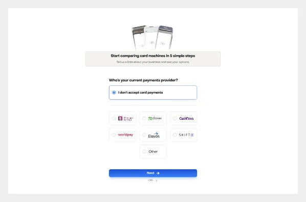
A shorter form
The form was the main drop-off point. I put every question through one simple test. Does the client genuinely need this to qualify a lead, or is it just nice to have? Anything that didn't pass got cut.
Results you can take in at a glance
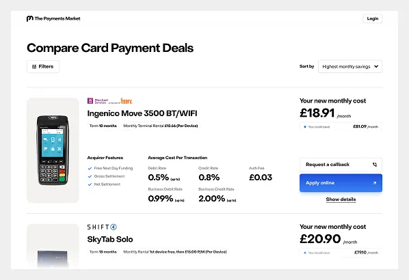
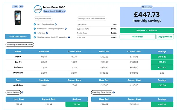
Each result card was showing so much that it overwhelmed people instead of helping them. I redesigned the cards so the most relevant details come first, with more available if you want to dig in. From there, users can apply directly or request a callback.
Result
More leads, and better ones. People reaching the results page are genuinely further along in deciding, which is what the client cared about most.
What I'd have shipped next
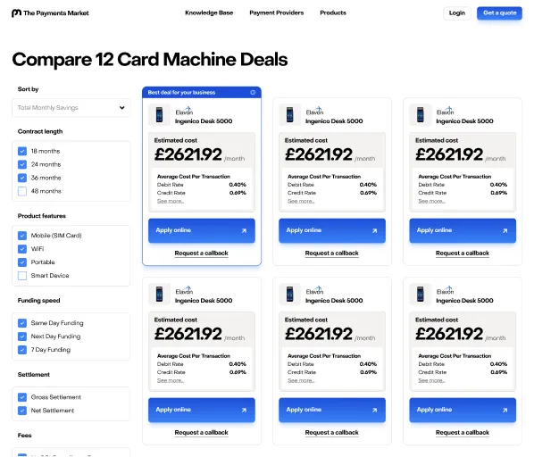
I designed a second version of the results page that never got built, because the project was shelved. The cards were smaller and easier to move through, and the best deal for each business was clearly highlighted.
The bigger lesson for me is that sites built to convert need treating like products, not pages. There's almost always something worth improving.

