Health tech newsletter — Marketing Website ©2026

Health Stack
Health Stack is a weekly health tech podcast and newsletter covering the biggest news, conversations and changes in the industry. They needed one website to bring the articles and podcasts together, with a single goal behind it. Newsletter signups. I had two weeks to design and build the whole thing.
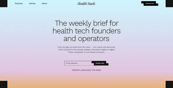
The problem
The project came through a referral from Highful Minds, who'd already done the branding. Type, colours and tracking were all set before I started, so my job was layout, structure and making the brand work on the web.
The real challenge was time. Two weeks left no room for long rounds of feedback.
Who uses it
Health Stack is for health tech founders and operators. It's a specific audience, and they need to recognise straight away that this is for them. Everything on the homepage is built around that.
Key decisions
Figma, sign-off, then straight into code
I designed it in Figma, got sign-off and went straight into development with custom code. I build faster that way than on any platform, so with a two-week deadline it was the obvious call.
A homepage that qualifies the reader
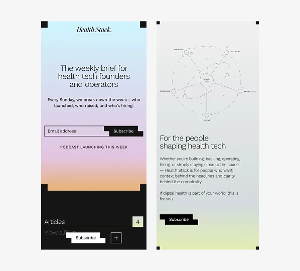
The page opens with a problem statement and frames the podcast and newsletter as the answer. Then it covers what listeners get, what's covered, who it's for and the host's credentials. Nothing's on there without a reason.
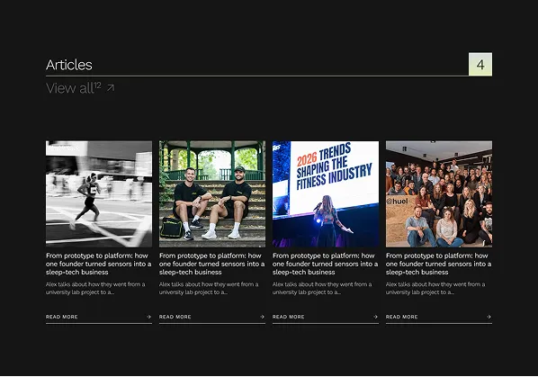
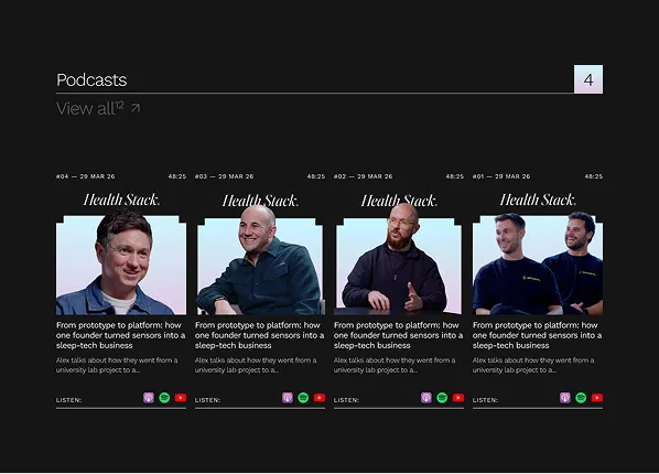

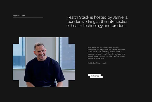
Signup the whole way down
The email signup sits at the top and bottom of the page, with a sticky CTA running throughout. If signups are the main goal, the design should keep pointing at them the whole way through, not just when you first land.
Result
Launched on time, in two weeks. The site is clear about what Health Stack does, who it's for and what to do next. The structure does the work of finding the right readers and moving them towards signing up.

