Clothing brand — Product Management App ©2026

Drop Dead Clothing
Drop Dead used spreadsheets, Dropbox and direct messages to manage product feedback. They'd moved to an internal app to bring it all together, but it wasn't working for half the people using it. I redesigned it, rebuilt it and moved it off the platform it was stuck on. It's now live on their own domain.
The problem
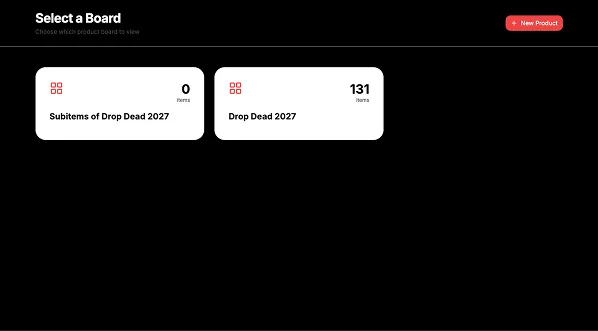
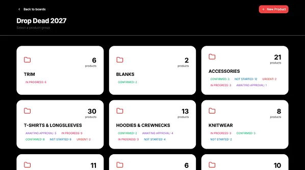
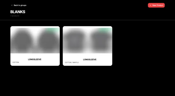
The app split everything across separate screens for collections, categories and products, so you had to click through several pages just to find something. And it was built for the person adding products, not the person reviewing them.
It also ran on a hosted platform that cost a monthly fee and locked the client in.
Who uses it
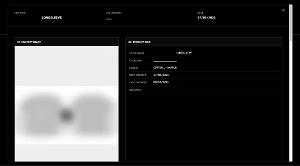
Two types of user. One adds products and makes changes, and needs to do it quickly. The other reviews products and leaves comments, mostly on their phone, and cares most about seeing the images properly.
The old app failed the second user, which is why the client hired me.
Key decisions
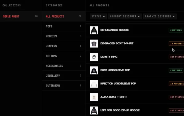
Three pages down to one
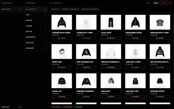
The client had a design concept that helped set the direction, and the first direction I designed became the final one. Collections and categories became two sidebars, with every product on one screen next to them. Products show on load, so you can see where everything's at straight away.
One product, one screen, no scrolling
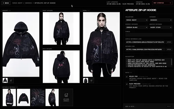
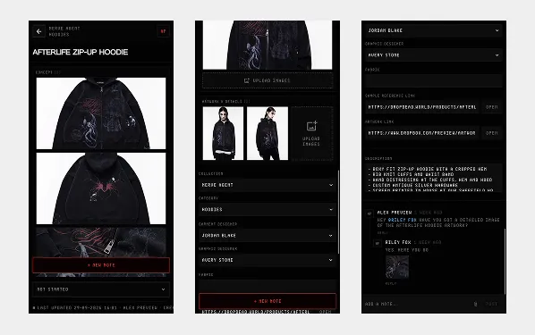
The client wanted the single product screen to fit without scrolling. The hard part was doing that while keeping the images big, because the images are what the reviewer needs most.
Built for reviewing on a phone
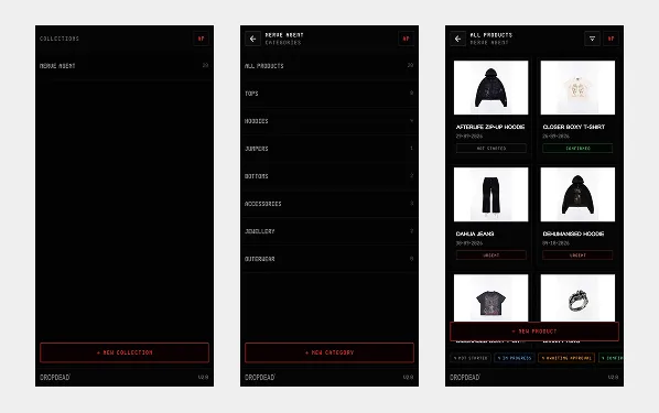
On mobile, the sidebars became their own screens and the products stayed in a grid. I added a sticky comment button to the bottom of the product screen, so leaving feedback is always one tap away.
Off the platform, onto their own API
The original plan was to redesign the app and put it back on the platform. Instead I pulled the code out, rebuilt it in React and connected it to the client's own API. It's now self-hosted, still syncs every change, and can be pointed at a different API later if they ever need to.
What changed after launch
Once the team was using it every day, a couple of things came up that only show up with real use.
Images that compress themselves. The server had a 4.5MB limit, and nobody compresses their photos before uploading them, because why would you. So people were getting errors all the time, and a load of big images was making the app slow. Now the app converts and compresses images automatically on upload, so nobody has to think about it.
V2. The client asked about a second version pretty much straight away. It added:
- Clearer statuses. Five statuses with updated colours, so you can see where every product is at a glance. Not Started (grey), In Progress (blue), Awaiting Approval (orange), Confirmed (green) and Urgent (red).
- Filters by designer. The products page can be filtered by garment designer or graphic designer.
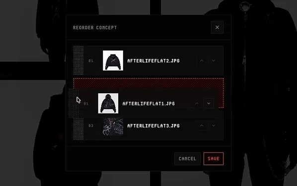
- Multiple image uploads on the single product page, and images can be reordered.
- Tagging and images in notes. Tag someone in a note so they know to jump in, and upload images that show right in the thread.
- An "All" category, so every product shows by default when the app opens.
Result
- 3 tools replaced by 1 app
- 3 pages down to 1
- 70% cheaper to run, saving £70 a month
- No platform lock-in, and an app the reviewers can actually use.
What's next
V2 is out, and the client came back asking for new features almost straight away. I'm still working with them to add new features and improvements.
“Worked on a few projects with Lee, each time he understands our desires within projects and is great at communicating with us.”

Ash Hall
Drop Dead Clothing

